
Summary: Today we have a quick look at the US economy. Where it’s at. Grading its performance. Where it’s going.
.

Contents
- The slow growth recovery
- Good news!
- Bad news!
- Perhaps very bad news: are we like Japan?
- The clock runs against us
- For More Information
.
(1) The recovery: slow steady growth
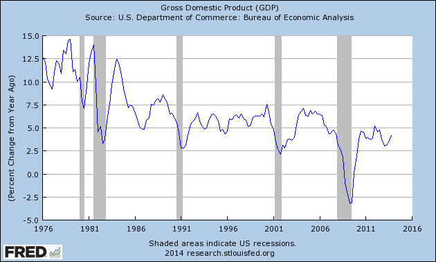
Before looking ahead, let’s look back. In November 2012 the consensus estimate of 2013 real GDP was 2.3% (Wall Street Journal survey of economists). Based on the preliminary estimates of Q4 GDP, current estimate of 2013 GDP is 2%, as of Friday. That’s reasonably close.
Is 2% good or bad? Context matters.
- 2% growth would be horrific for China with potential growth of 5% – 7%, per capita of $6,500.
- The US has grown at 2.2% since 2010, only slightly below the Fed’s 2.2% – 2.4% estimate of long-term GDP growth (a slowing from the post-WW2 average). So 2% is a disappointing slowdown.
- On the other hand, 2% is slow for a recovery, especially following the deepest recession since the 1930’s.
Worse, the trend of GDP has an ugly look. Real GDP might be stabilizing at a lower level of growth. For the second time. The first slowing was after 1980 (the oddly named “Reagan Revolution”).

.
But real GDP is not always the relevant number. In many ways we living in a nominal world. Profits, savings and many important factors require nominal growth. Unfortunately, the nominal graph looks similar to the graph of real GDP.
.
.
(2) Good news
The second half of 2013 was strong: the fiscal deficit fell, the job picture improved (e.g., falling new claims for unemployment insurance, steady growth in the number of new jobs), with strong growth in construction, manufacturing and exports.
Economists expect 2014 to be the year in which the US economy shifts into high gear. The consensus forecast is 2.8% (Wall Street Journal Survey). It will be a year of “Red, White, and Boom” (BofA), in which it reaches “escape velocity”.
If so, the government’s fiscal and monetary policy will have succeeded in supporting the economy until normal growth recovered.
On the other hand, even growth of 2% is adequate — if disappointing compared what America could do if better managed.

(3) The bad news
After a strong second half in 2012, the economy appears to have slowed in December. New orders in December’s durable goods report were down 4.3% (SA). December’s vehicle sales and housing data were also weak — both have risen for several years on low credit standards and low rates, drivers that now might be reversing. Some of this might have been from the weather. Update: January vehicles sales were also down.
Also, the turmoil in the emerging nations seems likely to depress 2014 exports.
Continued slow growth (~2%) in 2014 would be significant for several reasons.
- The inability to accelerate since 2010 decisively above 2%, despite years of stimulus, suggests some underlying problem in the US economy.
- Slow growth provides only a small cushion against shocks that can knock the economy into recession.
- Some economists believe the economy has a “stall speed” of ~2% (“Forecasting Recessions Using Stall Speeds”, Jeremy J. Nalewaik, April 2011), below which it falls into recession. Perhaps that’s why the Fed injected stimulus whenever growth fell below 2%. If so, slowing could pitch the economy into a recession.
Why so much worry during the past three years about a recession? With our high unemployment, moderately high fiscal deficit, and the Fed already running ZIRP & QE — we are weak and have relatively little capacity to fight a recession. A recession could quickly become very painful.
What comes next? We only know where the economy was a few months ago. Friday’s employment report will tells much about jobs and wages in January; the data in the next few weeks will tell us more.

(4) Perhaps very bad news: are we like Japan?
Japan has been in a slump since 1989, growing at ~1.1%/year. And that slow growth came from decades of zero interest rates and massive fiscal deficits (mostly wasted spending) — plus from exports, before so many nations seized upon exports as the key to growth
This has left Japan with enormous levels of government debt, so that a mistake or bad luck might cause economic disaster or een political regime change. It’s not a comforting example, except for believers in Modern Monetary Theory.
For more about this see: “Is America Turning Japanese?“, Brad Delong (Prof Economics, Berkeley), Project Syndicate, 30 January 2014.
(5) The clock runs against us
Context matters in another way. The US has had periods of economic stress before. For example, the great inflation of the 1970s, followed by the Volcker shock of 1980 – 1983. But America today differs in two great ways from anything in the post-war era:
- Those were years of debt accumulation, providing a strong steady wind at our backs.
- Those were the years of the boomers growth and maturity, another steady wind in our sails.
Both those trends are exhausted, and reversing. The younger generations have lower income growth than the boomers did at that point in their lives, with more debt from college. Meanwhile the boomers’ years of borrowing and accumulating goods are behind them. Worse, they enter retirement with astonishingly high levels of debt and low savings. For most retirement means a large drop in spending.
A few years of spending growth would better launch the younger generations and allow boomers to build savings before retirement.
There is a silver lining. Structural reform to our health care system (copying the best features of our peers’ systems) could pay large benefits to America. And looming ahead is the Third Industrial Revolution; the resulting boost to productivity erase many of our problem disappear (assuming we manage to distribute its bounty).

(6) For More Information
(a) Posts about the economy about…
(b) Posts looking at the economy today:
- Rising consumer debt driving the recovery: boon or bane?, 10 November 2013
- Larry Summers gives us the bad news. Worse, the only solution is more of the same., 20 November 2013
- The astonishing news about the December jobs report: it shows continued slow growth, 13 January 2014
- The state of the American middle class: are we thriving or sinking?, 15 January 2014
(c) Other posts about the consequences of our deficits:
- America is rich and powerful because we can borrow. Will this debt build a stronger America?, 5 June 2012
- America’s strength is an illusion created by foolish borrowing, 10 October 2012
(d) About monetary policy
- Do you look at our economy and see a world of wonders? If not, look here for a clearer picture…, 21 September 2013
- The great monetary experiment enters a new phase, with America as the stakes, 27 October 2013
- The key to understanding the future of QE3, and the future of our economy, 12 November 2013
- Has the Fed blown another housing bubble?, 30 January 2014
- A Fed Governor speaks honestly to us about the costs and risks of our monetary policy, 18 January 2014
.
.

Excellent summary. Except for the assertion ” the job picture improving (e.g., falling new claims for unemployment insurance, steady growth in the number of new jobs…).”
The numerical unemployment rate is indeed dropping — because boomers are retiring and discouraged workers have stopped searching for jobs entirely. This makes the drop in unemployment rates (U1 or U3 or U4, take your pick) wholly fictitious. In reality, job growth in the U.S. remains miserable and the statistics prove it incontrovertibly.
First up: it takes 104,116 jobs to maintain the current miserable depressed economic status quo in which 6 workers apply for every available job. The U.S. economy added a whopping 74,000 jobs in December 2013. Is this an economy in which “the job picture [is] improving”? Examine the data; decide for yourself.
Second, the employment to population ratio hasn’t budged one whit in the last year — so the net new job growth for the last year has effectively been zero. (In December 2012, the employment to population rate was 58.6%, and in December 2013 the rate was 58.6% — unchanged.
Source: The Bureau of Labor Statistics, U.S. government website.
But I must be delusional — after all, as FM points out, all the most respected economists (who denied there was a housing bubble in 2008, who denied that the bursting of the housing bubble would significantly affect the economy in 2009, and who predicted robust 4.5% GDP growth in 2010 after the Great Recession) say the opposite.
(See “The unofficial list of experts who were wrong about the housing bubble.”
Right?
Let’s hear from Bloomberg Business Week:
Source: “A Lost Decade For Jobs,” Bloomberg Business Week, 23 June 2009.
And how has the employment picture improved since June 2009?
Hardly at all.
Source: Peter Ferrara, Forbes magazine, 2 February 2012.
Worse still, Walter Bagehot’s words from Lombard Street (1876) return to haunt us:
This augurs ill for further bubbles heading into 2014. (And the U.S. economy is already firmly in the grip of a massive student-loan-tuition bubble, as this chart shows. Student loan debt recently passed consumer credit as the largest single source of individual debt in America.)
The most devastating damage wrought to the U.S. economy, however, has been through the loss of manufacturing. As U. of Penn professor Vaclav Smil points out
Source: “This is the man Bill Gates thinks you absolutely should be reading,” Wired magazine, November 2012.
Smil’s conclusion is supported by the research paper “Worse than the Great Depression: What experts are missing about American manufacturing decline,” The Information Technology & Innovation Foundation, 2012.
The same point is made by the Forbes article “Why Amazon can’t make a kindle in the USA”:
So it not only matters how many jobs the U.S. economy is creating, it’s crucial what kinds of jobs the U.S. economy is creating. And we appear to be failing badly on both counts.
But, as FM notes, the most prestigious economists disagree. Time will tell who is correct…the world-class economists, or your lying eyes?
Thomas,
“But I must be delusional ”
No. You are just bad at reading. I make very specific statements; your rebuttal concerns very different things.
You reply with “The numerical unemployment rate is indeed dropping …” I did not mention the unemployment rate — because it not a useful indicator, IMO. I made specific and accurate statements about employment and unemployment claims.
The other stuff you mention is beyond the specific scope of this post: long-term changes in US manufacturing, and so forth. I avoid your kind of grandiose talk because it is almost impossible to be both accurate and precise about such large-scale things — in the thousand or so words which are the maximum people will read in a post.
Many of the things you mention are discussed in other posts on the FM website, such as employment. These are complex matters.
I guess that what Thomas Moore is trying to say is that while there is more employed since 2008, there is also more unemployed people too, at the same time. total suffering is increasing. Population growth with steady employment population ratio means that there is more and more unemployed ones that need jobs.
That is the reason i do not see recovery; there is more and more unemployed ones, there is more suffering as population grows.
Nominal GDP growth is important as to not make things worse due to debt, private not public debt, but it doesn’t show how suffering or prosperity is distributed. Inequality is what shows that and what is really important for social cohesion. Nominal or real GDP can fall if inequality is improving and there would be no social crisis or debt crisis. This is what 90% marginal tax is good for and needed for to return prosperity from 1945-1967.
The growth of GDP in last 30 years was followed by ever higher inequality due to distribution bent toward 1% and their capture of lawmakers that decide on distribution means. This growth in inequality is what matters, not GDP per se.
Jordan,
“total suffering is increasing. Population growth with steady employment population ratio means that there is more and more unemployed ones that need jobs.”
You are as usual just making stuff up.
BLS reports 3 relevant numbers: employed, unemployed, and not in the labor force (i.e., not looking for work) but want a job. The first is increasing, the second two are decreasing — providing no support for your theory.
The increase in others — not in he labor force, not looking — are shown by BLS data to be mostly boomers retiring and young people staying in school. The former is inevitable, the latter hopefully a good thing.
Yes, GDP growth is not the same thing as distributional factors. I said that above, and have written a score of posts on the subject. I think most of us are quite clear on the distinction.
About the employment to population ratio
In my monthly reports about US employment I show the situation from different perspectives — because the economy is a complex animal, and counting jobs is not like counting apples.
Despite many simple-minded laypeople asserting soon articles, the E/P ration is not the definitive measure of employment, but just one of several windows on the reality. Here is a report by staff of the NY Fed looking at that number and adjusting for demographic trends:
“A Mis-Leading Labor Market Indicator”, Samuel Kapon and Joseph Tracy, 3 February 2014
http://libertystreeteconomics.newyorkfed.org/2014/02/a-mis-leading-labor-market-indicator.html#.Uu_Sa_Vsck8.twitter
To echo Thomas and Jordan here, the good employment numbers are worse than headline.
The BLS data (http://www.bls.gov/news.release/empsit.a.htm) show continued increase Y-o-Y of those not in the labor force. Labor force participation rate has dropped to 1978 levels and at present there seems to be be no slow down in this trend. As Thomas stated above, employed percentage of the population has not budged Y-o-Y.
I can’t find a link, but greatest increases in employment since 2008 have come from the 55+ age group. The youngest age group has seen no recovery whatsoever, but maybe that is the stay-in-school effect as noted in the reply.
Bonesetter,
Yoou guys can repeat this misinformation till the cows come home. It is still wrong
.
Fed research (and research by other economists I’ve cited during the past year or so) show thatt after adjusting for demographic change the e/p ratio shows the same slow growth as do the CES, CPS, ADP, and JOLTs surveys — and the long slow decline in the weekly new claims numbers.
I find discouraging the large volume of comments displaying outright disagreement with experts in both climate science and economists. Not just about forecasts (understandable; who knows the future?), but about simple and clear aspects of the pst and present.
Worse, presenting data has no effect on your opinions. Not just people like Jordan (obviously hopeless, most comments containing wildly ignorant statements) , but the others on this thread — level-headed intelligent people.
Reading the comments suggests that perhaps the1% are correct, and we cannot govern ourselves.
This is why I turned the comments off before. It’s not just that nobody profits from them (I have seen data affect people’s views only a doozen times after 40 thousand comments). It’s that they depress me.
Bonesetter,
Please look at the data I cited in this thread, and the more detailed information in the post about the December jobs report.
Young people are staying in school longers, which is a good thing. So the fraction of young people 16 – 25 with jobs is dropping. The Boomergs are aging, and steadily retiring or becoming disaabled — which is inevitable.
These are the facts; the debate is over the rate of increase and the future.
As for the Labor Force Participation rate: the rate for people 25-65 peaked in Q1 2000 at 84.1%. It’s now 80.8%. Much of that is more disabled people (old boomers) and falling participation rate of the disabled. ot the apocalypse.
I know you dislike ZH, but what is wrong with the data in this post and/or how does it fit with the changing demographic narrative?
http://www.zerohedge.com/news/2014-01-20/spot-labor-force-collapse-culprit
Bonesetter,
Who knows that ZH says, or if their graphs are correct. Life is to short to bother with them.
How about a deal. You pay attention to Zero Hedge. I will rely on the US Census, supplemented with private services (e.g., ADP,, Challenger), and academic economists).
Let;s check back in 5 years. My guess is that you will be wearing a tin-foil hat to protect yourself from the orbital mind control lasers, and have a stick of corn in your ears (for secret reasons).
Fabius,
Comments to the Kapon/Tracy paper point out that the BLS’ and Fed’s own data are in direct contrast to the paper’s conclusions. Maybe all comments sections suffer from ignorance equally :)
Bonesetter,
In America, perhaps.
This is why so many websites are turning off comments. I am seriously considering it (again). I keep hoping to have useful discussions. Instead we have mostly people insisting that the various experts cited are wrong. With near-zero capability of explaining why, other than making stuff up.
Reading the people on the climate threads insist that the majority of climate scientists are wrong (including the IPCC), but the leftist doomsters on their favorite blogs are right, has exhausted my tolerance for this. It’s a waste of time.
Editor says: “Young people are staying in school longers, which is a good thing”
I would argue that this point is debatable. I am aware of many people in my generation (those <30 years old) who have stayed in school because they believed getting Master's degree (or a PHD) would make it easier to get a high-paying job afterwards, only to discover after sinking tens or even hundreds of thousands of dollars, that it's simply not true.
If someone stays in school for a long time to acquire knowledge or skills that are not in demand (say a Master's Degree in Medieval Literature), this might lead to considerable personal enrichment, which is good of course, but I don't think it would be typically beneficial for a long-term career or for greater well-being, and probably not good for society as a whole either. In my view, the mismatch between the costs and benefits of traditional higher education will become a defining feature of my generation.
To the other point, mentioned above about employment-to-population ratio. I understand, and I hope the rest of us do as well, that this is simply one of many possible measures. Still, it is the most intuitive measure I can think of, and I imagine it's what most lay-people would understand when they hear the word 'unemployment'.
Also, please don't get too depressed about some commenter's not responding to the data you post. Some people are just stubborn. I for one appreciate seeing the actual data, rather than the 'how-does-the-economy-feel-to-you?' approach that many web articles take.
I read the Kapon-Tracy paper, another one by Canon-Debaut-Kadlyak, and looked at a number of FRED graphs on the topic of e/p ratio to get a more robust impression than just citations. FRED has “Civilian Labor Force Participation Rate” and “Employment Population Ratio” sets.
The e/p ration of 25-64 is in the order of 76% growing very slowly (from about 74% since the depth of the recession), and for 65+ in the order of 22.5% (growing from 20.5% at the bottom). So if the population is aging, people will move from cohorts with an average 76% e/p to another with much lower ratio — even if the older cohort e/p is actually increasing. This is what the Kapon-Tracy paper shows.
However, what it does _not_ show is an amelioration of the overall e/p, which is stagnating: it is only the gap between the “potential” e/p and the actual one which is slowly reducing. This is because the e/p of women has dropped to a low level, and the e/p of less than 25 years is collapsing — actually it does since year 2000, after remaining at a fairly high level for a long time — and stagnates at a very low level (globally in the low 30%, lower than at any time since statistics were recorded in the late 1940s).
When considering the cohort 55+, the e/p has been increasing since 1990, and is stagnating since the crisis at about 40%.
These evolutions are a bit confusing. Men from 25-55 have seen their e/p decrease almost continuously since 1950. Older people are working more, younger people participation is dropping, and women are exiting the labor force after entering it in ever greater numbers till 2000. The aggregate e/p may trend towards a somewhat acceptable level after corrections, but it hides some remarkable changes. No straightforward interpretation is possible, figures seem to coalesce long-term social trends, a serious impact of the crisis, and structural changes in the labor market since 1990.
By the way: the FED is not assuming that less than 25 years are actually going to school — it is much more cautious in its assessment: “To the extent that the decline for the youngest group is due to the time spent at school, it is possible that these workers will show a higher labor force attachment once they are out of school.” (from the second paper).
Very good, balanced summary.
The Japan parallel is what has disturbed me for a while.
Bryan,
The Japan parallel is disturbing many people.
I first wrote about it in 2009, when US economist and financial experts laughed at the idea.
After 4 years of 2.2% growth, despite massive stimulus, nobody is laughing at the idea.
I’ve considered that one of the endearing characteristics of the Japanese people is their ability to take a foreign idea or invention, and then push it to the limit of its potential. My favorite example is the 16th century matchlock gun which, within a century of acquiring a few from Portuguese traders, they were apparently producing in higher numbers and of better quality than any contemporary European nation. A few centuries later, with at least a few more examples of said characteristic in between, the Japanese had managed to build up their infrastructure, real estate, and economic systems to essentially the limits of modern feasibility, and that’s when things started to break down.
I remember thinking to myself back in 2008 when finance commentators started to compare the US market crash to that of Japan two decades prior, that we had joined them at the event horizon of modern economic theory, and no one could reliably predict what would come next, or how to escape.
It is not only Japan that confirms MMT, look at Britain’s debt
http://en.wikipedia.org/wiki/File:UK_GDP.png
It was twice ower 200% before it seized to be the world empire and it had 270% in 1815 and it still was an empire. Acctually i would argue that trying to lower such debt was the cause of decline.
Just take a look at video How economy works by Ray Dalio
http://www.youtube.com/watch?v=PHe0bXAIuk0
The first pic on this page is coming from this video but with “by Ray Dalio” erased. There is a notation under the pic that this is only a guess. This is not a guess, this is how money flows, it is not looking at production and movements of goods that most economist work on, it is based only on currency flow. It is very safe to assume that money moves goods, not the other way around, so it is sufficient to look only on money flow and to get to right conclusions.
Well, this description from the video is what MMT is based on; looking at money stock/flow and feedback loops just as any dynamic system is based on.
Steve Keen went even further and developed his program Minsky, based on this aproach with great 3D charts that shows black hole kind of developement which also explains Great Moderation period.
But MMT and Steve Keen are providing alternative solutions to such problem, alternative to what Ray Dalio provides at the end and what used to be a traditional treatment of recessions/depressions since Adam Smith except with Keynes solutions.
These are the people that predicted this crisis since they were only ones using such models. Peter Shiff was also using the same model but he proposes traditional solutions that Ray Dalio cites just as Andrew Mellon used to.
But this video explains only sovereign currency flows, where countries are not indebted in foreign currency, only in their own currency while proposed solutions should be applied only to those that are indebted in foreign currency. Only alternative quick solution (emphasis on quick in order to reduce prolonged suffering) i can think of, for countries indebted in foreign currencies is debt forgivness, but there are many solutions for countries that are indebted only in their own currencies. Even Paul Krugman addmited that he was not aware of importance of public debt not being in foreign currency.
Such countries are; USA, UK, AUS, Japan, Swizerland, Canada. Only one of them have reserve currency but all enjoy the benefits of being indebted in their own currency only and with floating exchange rate. Others have to follow different solutions but these countries can have high debt and low interest rate at the same time, no matter how high the debt is. These countries can have Central Banks fully controll interest rate no matter market conditions. There are no bond vigilanties possible. UK had to let go of fixed exchange when Soros attacked. After that, there were no issues.
Modern debt forgivness, as Steve Keen recomends, would be printing money without debt by states to provide for debt forgivness, This way the problem of banks’ balance sheet would be cured without any additional meassure while pure debt forgivness would need additional solution to banks. With such solution, banks would be also downsized since their assets would be paid off.
This kind of solution to PIGS debt crisis requiers ECB and rest of the EU to cooperate togheter, without any cost to them and allow printing of euro for debt forgivness. But then those that cite “moral risk” as not allowing them to reach quick solutions are guilty of causing such problems in the first place.
It turns out that the reason for euro crisis is desire of northern banks to take over markets in PIGS by destroying domestic banks. That is where all recomendations and conditioned bailouts lead. First to save northern banks (allready achieved) that extended too much in south markets and then to force southern banks to sell assets on the cheap in a fire sale. This is short of what Yanis Varoufakis and James Galbraith propose.
Jordan,
Your statements contain howlers, showing your ignorance of simple facts.
“Acctually i would argue that trying to lower such debt was the cause of decline.”
The British Empire fells for the same reasons every other Empire fell in the 20th century. Suggesting that MMT could have prevented that is nuts.
Just as implying that Japan is a MMT success story.
Your comments are a sad demo of how the wealth of info on the internet can make people less well informed. You would do well to stick to reading the Economist and NYT.
“You would do well to stick to reading the Economist”
I gave up on the Economist long ago.
The last article I read, and which determined my attitude after years of growing dissatisfaction, was a comparison of the health systems in the USA and various other countries (mostly European ones). On the statistical side it was seriously researched — there were graphs showing the evolution of health costs, tables detailing health outcomes in the population, and figures about cost inflation in traditional health systems, HMO and the like. The conclusion was obvious: the USA had the most expensive, least efficient health system, and innovations like HMO, after some promising initial results, did not bring the expected benefits. The Economist acknowledged that the US system was not as good as it was supposed to be, but, instead of calling for its overhaul, suggested that health systems prevalent in Europe would be well-advised to apply some of the US approaches to make them more competitive.
It was some 12 years ago. Maybe the Economist has changed, but at that time the ideological blinkers of its writers had become unbearable — it definitely warped their analyses, no matter how much quantitative evidence was biting their buttocks.
Guest,
That’s an important point! The Economist’s political perspective has, like most of the US news media, moved to the Right during the past 30 years (the Washington Post is the poster child here; I don’t know if The Economist is rule or exception in the UK).
But The Economist, as you note, usually keeps their analysis and politics somewhat separate. The other top media also do so, but IMO not as well.
I forget to add Reuters. When looking for news, Reuters is my first stop. Their columnists on economics are excellent, too.
Editor
“You would do well to stick to reading the Economist and NYT.”
Steve Keen writes for Business Spectator. MMTers are economic proffesors at UMKC and many other economists accept it.
Are you recomending that we all should be of monolithic faith and read only what is aproved?
Not to consider alternative aproach, ever? Especially not of those that predicted the crisis?
Not even to consider situations that point to alternative like Japan and Britain or USA in post WWII when it had highest public debt in % ever but the highest prosperity growth of all times at the same time? Not even to learn why and how it works?
Jordan,
That comment is nuts, like most of your comments.
I suggested reliable information sources for busy people with an interest in but little grounding in economics.
You are a living example of the possible sad result of reading more in-depth sources while lacking a grounding in the basics: confusion and ignorance.
Almost every comment of your shows your misunderstandings. In this one: debt accumulation boosts economic growth. Excessive debt growth brings payback: recessions or depressions (often exacerbated by malinvestments during the expansion phase).
Also, Japan shows that debt growth can be used to mask underlying structural problems, and delay pressure for reforms. That might also be true of the US.
This is all Econ 101-level info. Quite sad that you don’t know it.
Enough with the MMT advocacy, you are incapable of stating it accurately. Please stay on topic or you will be moderated again.
another place for more detail.
http://www.bea.gov/iTable/itable.cfm?reqid=51&step=1#reqid=51&step=51&isuri=1&5102=15
copy/paste this in a spreadsheet and go to town. Some of this really surprised me, hopefully I didn’t bungle the calculation.
—————————— >8 ————————-
The following looks only at trillion-dollar+ categories, over last 8 years. some categories may overlap.
top 5 growing (average annualized %change):
+4.5% education/health/social
+4.3% health care and social assistance
+3.9% federal
+3.6% professional business services
+3.5% non-durable goods (!)
bottom 5 growing (average annualized %change):
-2.2% construction
1.3% finance and insurance
1.4% durable goods
1.4% finance, insurance, real estate, rental, and leasing
1.5% real estate
top 5 accelerating growth (average annualized %change of yoy %change):
6.1% retail
5.8% information
3.5% durable goods
3.3% information-comms-tech
2.8% construction (rate of shrinkage slowing down??)
top 5 decelerating growth (average annualized %change of yoy %change):
-45.0% federal (! wow !!!)
-19.0% nondurable goods
-17.0% government
-14.8% general government
-12.3% state and local
oh yeah and top 5 “major” categories in this table, by 2012 gross $$, whatever that means
$5.8 Trill – manufacturing
$4.8 Trill – finance/insurance/real-estate
$3.4 Trill – government
$3.0 Trill – professional business services
$2.2 Trill – construction
(total: $19.2 Trill)
also these aren’t the same as the numbers that go into GDP
in terms of %GDP, the top 5 (2012) are:
19.5% finance/insurance/real-estate
13.5% government
12.5% manufacturing
11.9% professional/business services
8.2% education/health social
and lastly, top 5 by full-time-equivalent employment (2012)
20.1MM souls in government
18.4MM education/health/social
16.8MM professional/business services
12.9MM retail
11.7MM manufacturing
FM replies that I am bad at reading and that Jordan is “just making stuff up.” But neither of those statements appears accurate.
FM’s rebuttal to Jordan claims: “The BLS reports 3 numbers: employed, unemployed, and not in the labor force (i.e., not looking for work) but want a job.”
This is simply not correct. The BLS in fact reports 6 different numbers — U1 through U6, each measuring unemployment according to a different criterion. But the BLS also reports a seventh number, the employment-to-population ratio. And the BLS gives breakdowns for each state, as well as reporting a variety of other types of statistics.
FM’s refusal to acknowledge the wide variety of data published by the Bureau of Labor Statistics seems puzzling, since FM has remarked in the past that unemployment as well as economic growth numbers which appear monthly are noisy data — they tend to bounce up and down unpredictably. Worse, some of the numbers BLS reports are estimates based on numbers that are not well known or in some cases are just guesstimates, like U6. The U6 stat contains an estimate of the number of “discouraged workers” who have stopped looking for work because they’ve been unemployed so long that they realize they are for all practical purposes unemployable. But there is no way to directly measure the number of discouraged workers, so U6 contains a mathematical guesstimate subject to error bars. Likewise, many of these numbers contain revisions for seasonal labor market fluctuations which themselves much be revised. So we often see monthly employment numbers revised up or down as much as 50%.
However, as FM has pointed out elsewhere, we can dredge up some reasonably hard conclusions from these noisy data by checking our conclusions. If the BLS reports the employment situation getting better but the BLS also reports that the employment-to-population ratio hasn’t changed by even one tenth of a percent in over a year, then we can reasonably conclude that the statistical artifacts and noise in the monthly employment data are creating false impressions and that in fact no real employment growth is occurring. We can check our conclusions in another way, by seeing how many applicants there are for each job per state. In most states (with a few exceptions like the Dakos where there’s an oil boom), there are 5 to 6 applicants for every job. This does not occur in an economy anywhere near full employment. We can check our conclusions in yet another way by asking whether consumers are spending as much or more than their income. In an economy where the employment prospects are improving, consumers typically have extra cash to spend. By contrast, in the current economy, most consumers are now spending more than their income.
Source: “A familiar economic trend in America: Spending up, saving down,” The New York TImes, 26 December 2013.
This is a familiar pattern. It came to the fore in the stats of the 2000s during the housing boom. Consumers spent more than their income by reducing saving and going into debt. At that time, they thought the value of their houses would make up the difference. After the crash of 2009, the illusory value of their houses evaporated. Now consumers apparently think that the increase in GDP means employers will be hiring again — once again they’re in for a disappointment, for the stats show that employers have mainly chosen to offshore or automate or simply eliminate jobs instead of hiring new workers during this so-called recovery.
See “The myth of American productivity,” Washington Monthly, January 2012.
Also see “The STEM shortage is a myth,” IEEE Spectrum, 30 August 2013.
In actual fact, a good deal of the so-called “economic recovery” since 2009 results from worthless pointless productive manufacturing like the production of army tanks — see the article “The end of the tank? The Army says it doesn’t need it, but industry wants to keep building it,” The Washington Post, 30 January 2014.
This kind of so-called “economic growth” (building worthless non-working superweapons which wind up rusting at some army base or blown up in some third world hellhole) generates dramatically less secondary economic growth than building, say, an oven which gets used in a restaurant that then sells food and hires cooks and waitresses, or a delivery truck which gets used in a small business that then hires delivery drivers and accountants and payroll managers and clerks and pays auto repair specialists to keep the truck running. By contrast, an artillery shell once built gets blown up and creates no secondary wealth. A tank, when built, sits and rusts because large land wars are now a thing of the past.
Source: “The U.S. Employment Effects Of Military And Domestic Spending Priorities: 2011 Update” (.pdf)
Thomas,
This is just sad.
I didn’t say that BLS reported only 3 numbers. They report thousands of numbers. I said that I don’t believe the unemployment rate number is useful, and then I give three numbers they report which are — collectively — more useful.
Thomas, again, goes and talks about the unemployment numbers. Yes, they report six unemployment rates. But, as I said, the unemployment rate is not a useful number. Not any of the six. Why is this not clear to you?
By the way, each monthly employment on the FM website reports gives the changes in the six unemployment rate numbers. So, yes I am familiar with these.
No, you are not very good at reading.
Then you go into another subject.
This thread is very discouraging. Much like the climate threads, the people commenting here (most of them) have contempt for professionals in the area, and rely on their own flawed analysis. It’s a triumph of the US education system at building self-esteem. But pitiful otherwise.
Hi, Great blog. Many of the world economy is likely to emerge from its extended “soft patch” of the last two years, I hope US momentum will increase and the number of jobs will increase to its previous path.
Thanks for this post.